The digital landscape continues to evolve at an astonishing pace, but one thing remains constant: the mobile device has become our primary window to the online world. By 2025, consumers are more reliant than ever on smartphones and tablets for everything from shopping to research and communication. However, the conversation around mobile design isn’t just about “making a site fit on a small screen.” It’s about crafting an experience specifically tailored to the needs and behaviours of mobile users—and doing so from the ground up.
In this blog, we’ll explore why mobile-first is still a critical approach in 2025, how user expectations have changed, and what best practices can help you stay ahead in an ever-competitive environment. We’ll also touch on how leading agencies like Techomatic use mobile-first design principles to deliver robust, future-proof websites that meet both user and search engine demands.
1. The Rise (and Ongoing Reign) of Mobile
1.1 Mobile Usage: A Quick Snapshot
We’ve all heard the statistics: mobile traffic officially overtook desktop usage several years ago. Now, in 2025, more than three-quarters of global internet traffic comes from mobile devices. This trend shows no sign of slowing, driven by factors like:
•Growing smartphone penetration in both developed and emerging markets.
•Improved network speeds, including widely accessible 5G (and the oncoming 6G horizon).
•Wearable technology and internet-enabled devices that blur the lines between “phone” and “computer.”
What does this mean for web design and user experience (UX)? Quite simply, if your site isn’t optimised for mobile users, you risk alienating the majority of your potential audience.
1.2 The Mobile-First Approach vs. “Mobile-Friendly”
It’s easy to assume “mobile-friendly” equals “mobile-first,” but these are two distinct philosophies:
•Mobile-Friendly: Ensures that a desktop-based website is responsive and looks good on smaller screens.
•Mobile-First: Starts the design and development process with mobile devices as the primary target, then scales up to tablets and desktops.
By prioritising mobile during the initial design phase, you’re not just shrinking a site to fit a smaller screen—you’re creating experiences that feel native to the way users browse, tap, and scroll on mobile devices. This approach inherently leads to cleaner, faster, and more intuitive websites.
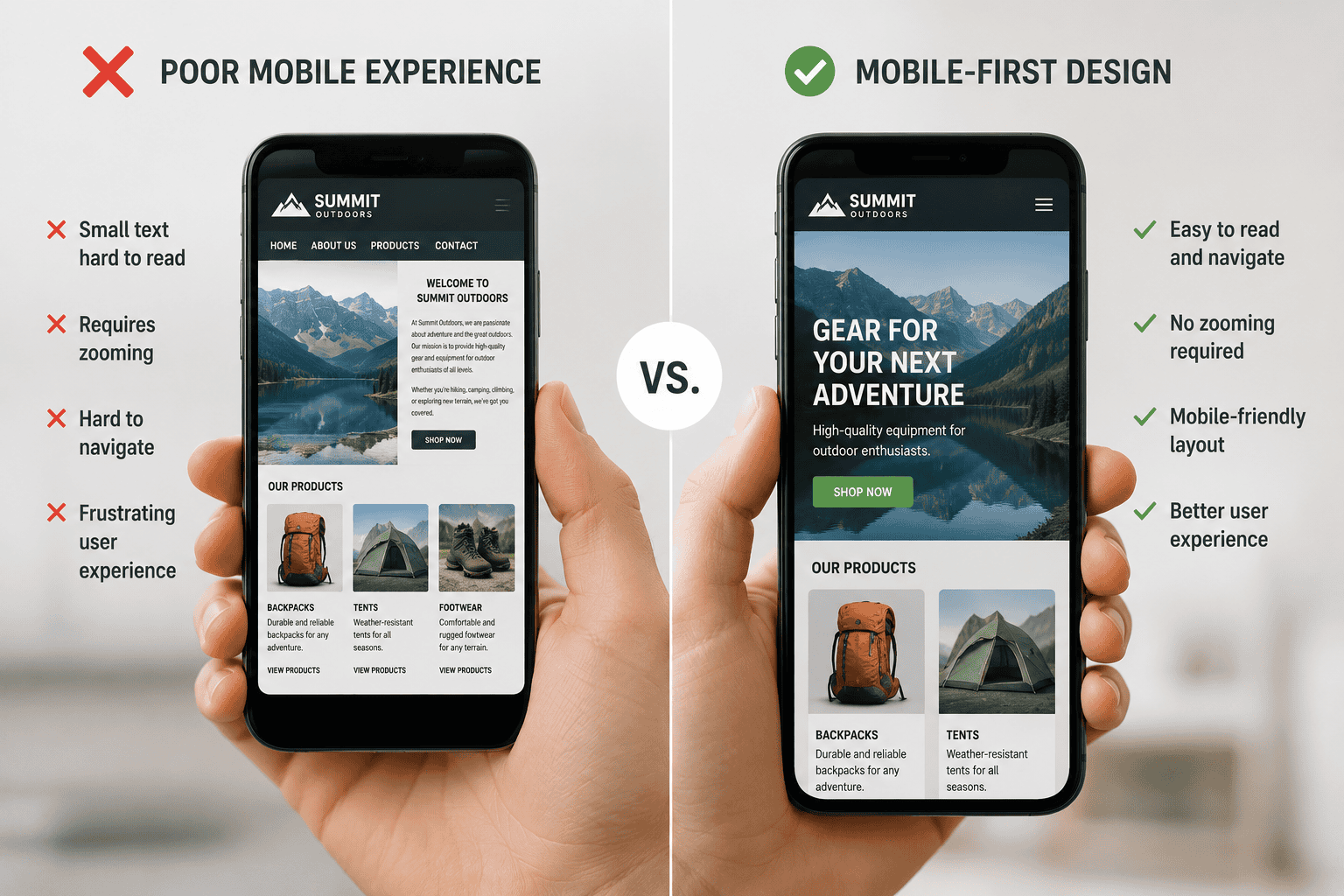
2. Why Mobile-First Still Matters in 2025
2.1 User Expectations Have Skyrocketed
Today’s mobile users demand instant gratification—pages that load within seconds and navigation that’s simple and intuitive. Slow, clunky mobile experiences lead to higher bounce rates and abandoned carts. A mobile-first design ensures your site is primed for swift loading and a seamless user journey, whether someone is on the bus, in a café, or multi-tasking at home.
Moreover, 2025’s consumers are accustomed to high-quality native apps. They expect a similarly frictionless experience when they visit your website. This puts enormous pressure on designers and developers to replicate app-like fluidity and responsiveness in a browser-based environment.
2.2 Search Engines Reward Mobile-Focused Websites
Google’s shift to mobile-first indexing, which began rolling out in earnest several years ago, continues to evolve. In 2025, search engine algorithms are more sophisticated in measuring user experience signals such as:
•Core Web Vitals (Largest Contentful Paint, First Input Delay, and Cumulative Layout Shift)
•Mobile responsiveness (automatic resizing, intuitive navigation)
•Page loading speed on 4G, 5G, and potentially emerging 6G connections
Sites that excel in these areas typically see improved rankings. By adopting a mobile-first approach, you naturally optimise for these crucial metrics. Additionally, voice search—often used on mobile—continues to rise in popularity, meaning mobile-first sites that are well-structured for conversational queries also have a distinct SEO edge.
2.3 Enhanced Accessibility and Inclusivity
An often-overlooked advantage of mobile-first design is its role in improving accessibility. A clutter-free layout with clear tap targets, balanced contrast, and straightforward navigation is friendly not just for the average user, but also for those with visual or motor impairments. Designing with the smallest screens in mind helps enforce a minimalist style—only the essentials remain. This approach typically benefits every visitor, ensuring your site is usable by the widest range of audiences possible.
3. Key Trends Driving Mobile-First Design in 2025
3.1 Dark Mode and Thematic Colour Shifts
While the option to switch to dark mode has been around for a few years, in 2025, it’s virtually the norm. Users can toggle between light and dark themes depending on personal preference or ambient conditions. Designing a site to accommodate theme shifts smoothly is now a must. Careful attention should be given to contrast ratios, typography, and brand consistency across both modes.
3.2 AI-Powered Personalisation
AI-driven personalisation isn’t just about product recommendations anymore. Modern algorithms can adapt layout elements based on user behaviour, time of day, or even device battery levels. For example, if a user frequently accesses your site in bright outdoor conditions, the interface might automatically switch to a higher contrast for better readability. By prioritising AI personalisation in your mobile-first framework, you create a truly tailored experience that resonates with each individual user.
3.3 Augmented Reality (AR) Integration
With the advent of more powerful mobile processors, AR experiences have become common on e-commerce and service websites. Imagine trying on a piece of furniture in your living room with your phone’s camera or previewing a hairstyle before booking an appointment. These AR features require a user interface designed specifically for smaller, handheld screens. A mobile-first approach ensures your AR elements are intuitive and robust.
3.4 Gesture-Based Navigation
Home buttons have been disappearing for years, but by 2025, gesture-based controls are even more ubiquitous. Swiping, pinching, and tapping gestures now form an essential part of modern UX. Mobile-first designs capitalise on these intuitive actions, allowing users to navigate your site with minimal friction. For instance, a quick swipe can reveal a hidden menu or a pinch-out gesture can bring up additional content.
4. Best Practices for Mobile-First Design
4.1 Prioritise Speed Above All Else
Your site’s performance is tied directly to user satisfaction and SEO. Some ways to ensure speed:
•Optimise images and videos: Use next-gen formats (e.g., WebP), compress files, and serve media at the correct resolution for each device.
•Leverage lazy loading: Load content only as it’s needed, reducing initial load times.
•Minimise scripts and CSS: Inline critical CSS and defer non-critical scripts.
A snappy mobile-first site not only retains users but also signals to search engines that you prioritise a positive experience.
4.2 Keep Navigation Simple
On a smaller screen, even the slightest complexity can become daunting. Some navigation tips:
•Use a clear, concise menu: Prioritise the most important sections.
•Sticky navigation: Keep key navigation elements visible as the user scrolls.
•Easy returns to homepage: A visible home icon or company logo leads back to the main page.
In 2025, minimalism isn’t just a design trend; it’s a usability necessity.
4.3 Employ Responsive and Adaptive Techniques
While mobile-first means starting with the smallest screen in mind, your site must scale gracefully up to tablets, desktops, and even large smart TVs:
•Fluid Grids: Use percentage-based widths and min/max values to ensure elements resize appropriately.
•Adaptive Images: Serve different image sizes based on device width and resolution.
•Breakpoints: Define breakpoints for common screen sizes (mobile, tablet, laptop, desktop), ensuring a smooth transition between formats.
4.4 Make CTAs Prominent and Tappable
Calls-to-action (CTAs) are the lifeblood of most websites. On mobile, they must be instantly visible and easy to tap:
•Use high-contrast colours that stand out from the background.
•Button size: Aim for a minimum touch target of around 44×44 pixels to accommodate different finger sizes.
•Minimal text: Keep the CTA message crisp—nobody wants to read a paragraph on a button.
5. Mobile SEO Optimisation Tips
5.1 Embrace Schema Markup and Structured Data
With smaller screens and heightened competition, rich search results are more valuable than ever. Schema markup helps search engines understand your content’s context, making it eligible for rich snippets, FAQs, and other eye-catching search features. For local businesses, ensure you use LocalBusiness or Organisation schema to show up in local searches more prominently.
5.2 Optimise for Voice Search
Voice assistants are increasingly baked into our daily routines. By 2025, many people use them on mobile devices to complete tasks hands-free. Focus on conversational keywords, long-tail phrases, and a concise style of writing. Consider creating Q&A sections that directly address common user questions with succinct, direct answers.
5.3 Ensure Fast Server Response Times
Even if your site is lightweight, a slow server can sabotage your performance. Employ caching strategies, use a reliable hosting provider, and consider content delivery networks (CDNs) to deliver content from servers closer to the user’s geographical location.
5.4 Leverage Progressive Web Apps (PWAs)
PWAs bridge the gap between websites and native apps, offering features like offline access and push notifications. They also load faster, thanks to caching mechanisms. In many cases, a PWA can appear as an app icon on a user’s device, deepening engagement and brand presence.
6. Case Studies: Real-World Impact of Mobile-First
6.1 Retailer Increases Conversions by 40%
A mid-sized ecommerce retailer decided to redesign their site using a mobile-first strategy. By simplifying navigation, optimising product images, and integrating AI personalisation, they reduced page load times by half. As a result, mobile users spent more time browsing and the site’s checkout abandonment rate dropped significantly—leading to a 40% boost in overall conversions.
6.2 B2B Website Gains Search Visibility
A business-to-business consultancy found that their mobile traffic bounce rate was much higher than on desktop. After a mobile-first overhaul, which included better readability for white papers and easy-to-tap contact buttons, their average session duration on mobile climbed by 35%. Google rewarded this improved user engagement, and the site jumped to the first page for several high-value keywords.
6.3 Local Restaurant Improves User Experience
A local family-run restaurant typically received most bookings via walk-ins or phone calls. Post-pandemic, they noticed a shift towards mobile reservations. By adopting a mobile-first site with a quick online booking system, they streamlined their reservation process. Within six months, they saw a 25% increase in total bookings, most of which came from mobile users.
7. How Techomatic Approaches Mobile-First in 2025
At Techomatic, we’ve been passionate advocates of mobile-first design for years, and that commitment has only deepened by 2025. Here’s how we ensure our clients’ websites remain at the cutting edge:
1.In-Depth Site Audits: We examine your site’s current mobile performance, speed, and user experience, pinpointing pain points and opportunities.
2.Strategy Consultation: Our team collaborates with you to define your key objectives—whether that’s increasing sales, generating leads, or boosting brand visibility.
3.Data-Driven Design: Using advanced analytics, AI insights, and user testing, we create designs that directly address your audience’s needs.
4.Iterative Development: We adopt an agile methodology, continuously refining your site’s layout and features based on real-world user feedback.
5.Ongoing Optimisation: Post-launch, we don’t just walk away. We monitor site metrics, tweak SEO, and apply updates to keep your website relevant and high-performing.
By combining cutting-edge technology with user-centric principles, Techomatic ensures your mobile-first website stands out in a crowded digital landscape.
8. The Road Ahead: Beyond 2025
8.1 Foldable Devices and Wearables
Foldable screens have been around for a few years now, but by 2025, they’re poised to become more commonplace. Designers must account for transitions between different screen sizes in real time, ensuring a site’s layout adapts seamlessly as a device is folded or unfolded. Similarly, wearables like smartwatches require ultra-condensed interfaces that deliver vital information at a glance.
8.2 Hyper-Personalised Web Experiences
AI will continue to evolve, enabling deeper personalisation across every facet of your site. Expect advanced user profiles that combine browsing history, location data, and even biometric information (where ethically and legally permissible) to serve content that is “perfectly you.” For businesses, striking a balance between personalisation and privacy compliance will be crucial.
8.3 The Ongoing Importance of Security
With more users relying on mobile devices for transactions and data sharing, security remains a paramount concern. HTTPS, two-factor authentication, and robust encryption have become the norm. As you craft your mobile-first approach, integrating advanced security features is a key pillar, not an optional extra.
9. Action Steps to Elevate Your Mobile-First Strategy
If you’re ready to invest in a mobile-first approach—or looking to enhance an existing one—here are some concrete steps:
1.Audit Your Current Metrics: Start with data. What’s your mobile bounce rate? How quickly do your pages load on a 4G or 5G connection?
2.Identify Quick Wins: Sometimes small tweaks—like compressing images or cleaning up JavaScript—can dramatically improve mobile speed.
3.Reassess Content Strategy: Mobile-first often means concise, bite-sized content. Can you cut down on fluff while retaining value?
4.Test Across Devices: Don’t assume that “mobile” just means an iPhone 12 or Samsung Galaxy S series. Test across various screen sizes, brands, and operating systems.
5.Partner with Experts: Working with a team like Techomatic can save you time and ensure you leverage the latest best practices.
6.Iterate and Improve: Mobile design is an ongoing process. Gather user feedback, monitor analytics, and remain open to iterative updates.
Conclusion
By 2025, mobile-first design isn’t merely a recommendation—it’s the baseline standard for anyone hoping to remain competitive in a digital world dominated by smartphones and tablets. It’s about more than just making your site “look good” on a smaller screen. It’s a comprehensive strategy that prioritises speed, usability, accessibility, and personalisation at every step.
Designing for mobile users first fosters a cleaner, more intuitive interface that benefits all visitors, whether they’re browsing on a phone, tablet, or desktop. Combine this with robust SEO techniques—like structured data, fast loading times, and voice-friendly content—and you’ll be well-positioned to climb the search rankings and capture the attention of potential customers.
At Techomatic, we see this mobile-first future as a realm of exciting possibilities. Advances in AI, AR, and device technology will continue to shape the online experience, but the cornerstone will always be ensuring users can effortlessly engage with your content from the palm of their hand. As user expectations evolve, websites that deliver on speed, usability, and personalisation will thrive—and adopting a mobile-first approach is the surest way to get there.