A grey wordpress logo

WordPress Security In 2026: A Practical Playbook For Bradford Businesses

WordPress Security In 2026: A Practical Playbook For Bradford Businesses

Why website security is now a growth issue, not just an IT job

Security used to be a background task for “the tech team”. In 2026 it is directly tied to sales, SEO and brand reputation. A compromised WordPress site loads slowly, throws scary warnings, or redirects visitors to spam pages—killing enquiries overnight. Search engines will flag or de-index hacked pages, paid ads pause, and customer trust takes months to rebuild. If you serve customers in Bradford and across West Yorkshire, keeping your WordPress site secure is one of the most important things you can do to protect revenue and keep your marketing spend working.

What attackers actually do to WordPress sites

Most breaches are not cinematic heists; they are automated bots probing for easy wins. Common routes include outdated plugins and themes with known vulnerabilities, weak admin passwords, insecure hosting, and form or upload endpoints that accept malicious code. Once in, attackers plant backdoors, inject SEO spam, add rogue administrator accounts or hijack your email forms to send phishing messages. Prevention costs little compared to the disruption and clean-up bill of a real incident.

The Bradford checklist: basics that stop most attacks

Keep WordPress core, themes and plugins updated
Updates patch known exploits, and attackers scan the web looking for sites that have not applied them. Review your stack monthly, remove anything you no longer use, and favour reputable, actively maintained plugins.

Use strong authentication
Require unique, long passwords and enable two-factor authentication for every administrator. Limit the number of admin accounts and use Editor roles for day-to-day content changes. If suppliers need access, create temporary accounts and revoke them when the work is done.

Lock down the login
Rate-limit login attempts, hide or rename the default login path if appropriate, and consider CAPTCHA on forms used by bots. Avoid email addresses that are easy to guess as usernames. If you allow customer logins, set sensible password policies and password reset controls.

Choose secure, UK-centric hosting
Reliable UK hosting with automatic HTTPS, HTTP/3 support, daily backups and staging environments is the foundation of a safe site. Ask your host about web application firewalls, malware scanning and DDoS protection. Good hosting reduces patching friction and improves performance, which supports both SEO and user trust.

Harden file permissions and disable what you do not need
Follow least-privilege principles for file permissions, disable file editing in the WordPress dashboard, and restrict XML-RPC if you are not using it. Small configuration changes remove entire classes of risk.

Security checklist illustration featuring a clipboard with completed security checks, shield and padlock icons, firewall protection, password security and cybersecurity monitoring symbols in a clean flat vector style.

Backups: the recovery plan that turns a crisis into an inconvenience

Backups are your parachute. Store them off-site, encrypt them, and test a restore regularly. For brochure sites, daily backups are fine; for WooCommerce stores, use hourly database backups so you never lose orders or customer accounts. Keep at least two weeks of backup history so you can roll back to a clean version if malware went undetected for a few days.

Firewalls and malware scanning that actually help

A web application firewall (WAF) sits between the internet and your website, filtering malicious requests and blocking common attacks like SQL injection or brute-force logins. Pair the WAF with scheduled malware scans that check core files, themes and plugins against known good versions. Configure real-time alerts so you hear about problems immediately, not a week later when leads have already disappeared.

Keep plugins lean and reputable

The easiest way to reduce your attack surface is to run fewer, better plugins. Audit your list quarterly. Remove anything you do not use or that duplicates another tool. Before installing a new plugin, check the update history, active install count and support activity. If a plugin has not been updated in over a year or the developer is slow to answer security issues, it does not belong on a business-critical site.

Secure forms, uploads and user-generated content

Contact forms, comment boxes and file uploads are frequent attack vectors. Validate inputs server-side, limit file types and file sizes, and store uploads outside publicly accessible folders where possible. Add spam protection that does not punish real users—lightweight honeypots and rate limiting are often better than hostile CAPTCHAs. Always send form submissions to named team inboxes, not a generic address that nobody checks.

Performance and security go hand in hand

A secure site is usually a fast site. Server-level caching, a CDN, optimised images and tidy JavaScript reduce the load on your infrastructure and make it harder for attackers to overwhelm your server. On WordPress, prioritise Core Web Vitals: a quick Largest Contentful Paint, responsive Interaction to Next Paint and stable layouts. Your visitors get a better experience and your security systems have more headroom to work effectively.

Monitoring that gives you time to react

Set up uptime monitoring with instant alerts by email and SMS so you know within minutes if the site goes down. Track file changes and suspicious admin logins. Keep a daily digest of security events for sanity checks, and agree who in your team owns the first response. For larger sites, server logs and error logs are invaluable for spotting patterns before they escalate.

What to do if you think you have been hacked

Take the site offline if it is serving malware or phishing content
Your brand and users come first. Put up a short maintenance page while you investigate so you are not spreading harm.

Change passwords and revoke access
Reset all administrator passwords, rotate keys and tokens, and remove any unfamiliar users. If a supplier account is suspected, disable it until you have clarity.

Restore from a clean backup
Roll back to the last known good backup, then update everything before bringing the site live. If no clean backup exists, engage a specialist to identify and remove malware and backdoors properly.

Audit and patch the root cause
A temporary fix is not enough. Identify how attackers got in—an outdated plugin, weak credentials, a vulnerable theme—and close that door so it cannot happen again. Document the incident, including timelines, actions and lessons learned.

Request de-indexing of spam URLs
If spam pages were created, remove them and use Google Search Console to request removal. Monitor for a few weeks to ensure the problem does not reappear.

WooCommerce has extra moving parts

Shops need stricter controls. Protect checkout and account areas from caching mistakes, keep payment gateways and webhooks up to date, and test transactions on staging whenever you update. Monitor orders for anomalies, such as sudden spikes from unfamiliar geographies or mismatched AVS/CVV results. Ensure transactional emails are delivered from authenticated domains (SPF, DKIM, DMARC) so customers receive confirmations reliably.

WooCommerce security illustration showing an online store connected to plugins, databases, payment systems, user accounts, backups and security protection tools, highlighting the complex behind-the-scenes components that require ongoing monitoring and protection in a clean flat vector style.

Policies and people: the human side of security

Most incidents start with a small human slip—reusing passwords, installing a risky plugin, or granting full admin access to a contractor for a five-minute fix. Write a short, practical policy that covers passwords, updates, plugin approval, user roles and how to report a suspected issue. Keep it simple and train new team members as part of onboarding. The aim is to make the secure path the easy path.

A 30-day plan for Bradford organisations

Week 1: Audit and quick wins
List every plugin and theme, remove what you do not need, apply outstanding updates, and enable two-factor authentication for all admins. Confirm your host provides off-site backups and staging.

Week 2: Hardening and monitoring
Configure a WAF, set sensible login rate limits, disable file editing and restrict XML-RPC if unused. Add uptime monitoring and daily malware scans with alerts.

Week 3: Backups and recovery drills
Test a full restore on staging. Fix anything that slows recovery—missing database credentials, broken paths, or unclear responsibilities.

Week 4: Process and prevention
Document a lightweight update workflow that uses staging and rollback points. Create a one-page incident response plan with the who, what and how for the first hour of a breach.

Why choose a Bradford-based security partner

Security improves fastest when you can speak to a human who understands your stack and your business. Because we are based in Bradford, near Leeds Bradford Airport, we can meet quickly, run a hands-on audit and implement a hardening plan without disrupting your marketing calendar. We look after WordPress and WooCommerce sites for West Yorkshire organisations that need dependable performance and the peace of mind that comes with solid backups, fast patching and a clear recovery path.

A computer display showing a slash between two chevrons

WordPress Lead Generation That Actually Delivers: A Bradford Guide For B2B And Service Brands

WordPress Lead Generation That Actually Delivers: A Bradford Guide For B2B And Service Brands

Why lead generation starts with user experience, not just traffic

Most businesses in Bradford and across West Yorkshire do not have a traffic problem—they have a conversion problem. Paid ads, SEO and social can all bring visitors, but if your WordPress site makes it hard to enquire, people leave. Real lead generation is the combination of a clear value proposition, fast pages that work on a phone, helpful content that answers questions and forms that feel effortless. Get those right and every marketing pound goes further.

Positioning your offer so visitors know they are in the right place

Start with a short value statement at the top of the page that says what you do, who it is for and the outcome in plain English. For example, Website design and SEO for growing SMEs in Bradford and West Yorkshire, focused on faster sites and more enquiries. Avoid jargon; speak to the problems your buyer has today—slow websites, dated design, poor rankings, low enquiry quality—and promise a credible path to change. Reinforce this in your headings, meta title and meta description so the message matches what people saw in search.

The anatomy of a high-converting enquiry page

Your enquiry page is where most B2B and service leads begin. Keep the layout light and fast, and structure it around clarity and reassurance.

Headline and subhead that set expectations
Use a single, straightforward headline and a subhead that explains what will happen next. For example, Request a 20-minute call to discuss your project. No hard sell—just practical advice.

Short, progressive form
Ask for first name, email and one qualifier such as company or website URL. Use a simple multi-step flow if you truly need more detail, revealing fields gradually. Add optional checkboxes that capture zero-party data like timeframe or budget range, but keep the first step friction-free.

Proof without noise
Place one or two Bradford or West Yorkshire case studies below the form with a result in numbers: faster load times, improved conversion rate, stronger rankings. Link to the full story for those who want depth.

Clear next steps
Explain how and when you will respond, and who will be in touch. A named human beats a generic team inbox every time.

Accessibility and trust
Make labels and errors clear, provide adequate target sizes on mobile and show your privacy promise in plain English. This helps real users and supports SEO through better engagement.

Fast WordPress websites win more leads

Page speed is practical sales enablement. People will not wait for a slow site to load, especially on 4G. Focus on Core Web Vitals:

Largest Contentful Paint
Preload the hero image, compress it to WebP and keep the hero layout simple. Huge sliders rarely help anyone.

Interaction to Next Paint
Reduce JavaScript bloat by trimming heavy plugins and deferring non-essential tags. Replace animated page builders with lighter blocks where possible.

Cumulative Layout Shift
Reserve space for banners and embeds so the form does not jump as fields appear. Stabilising the layout reduces frustration and improves completion rate.

Pair a lean theme with quality UK hosting, server-level caching and a CDN. For busy times, object caching helps WooCommerce and large catalogues; for service sites, a clean stack makes every form feel snappier.

Content that attracts the right enquiries

Good content filters in the right buyers and filters out the wrong ones.

Service pages that read like solutions
Explain the problem, your approach, the deliverables and typical timelines. Avoid vague claims; be specific about what is included and what happens after launch. This sets healthy expectations and improves lead quality.

Case studies with outcomes
Tell short stories with goals, actions and results. If confidentiality is needed, describe the sector and challenges, not the name. Include a single call to action that invites similar businesses to start a conversation.

Guides that solve common headaches
Publish practical pieces on topics you fix every week—Core Web Vitals, Consent Mode and GA4, WordPress security, local SEO in Bradford. Use internal links to route readers to your related service pages and enquiry form. Consistency and clarity are what earn rankings and enquiries.

FAQs that reduce hesitation
Answer real pre-sales questions straight from sales calls: how long projects take, who provides content, what support includes, how you price. Add these to service pages and your enquiry page so people can move forward with confidence.

A laptop screen showing a mockup of a website

Using first-party data to personalise without being creepy

Invite visitors to tell you what they need. A two-question chooser on the enquiry page—What are you here to do today? with options like Redesign our website, Improve SEO or Speed up WordPress—guides people to relevant content while capturing intent. Keep answers optional and show how the information helps you tailor advice. Pair this with a clear cookie banner and Consent Mode so analytics and ads respect user choice.

Tracking that helps decisions, not dashboards

Set up GA4 events that mirror commercial intent: form_started, form_submitted, click_to_call, file_download, meeting_booked. Name them consistently so your CRM can understand them. Use UTM parameters on campaigns and Google Business Profile links so you can see which sources drive quality leads in Bradford and West Yorkshire. Review assisted conversions too; many B2B journeys span multiple sessions before an enquiry.

Email follow-up that feels like a conversation

Leads fall through the cracks when follow-up is slow or vague. Send a friendly, plain-English email within minutes of the form submission confirming what you will do next and offering one useful resource that matches their need. If the prospect selected Improve SEO, send a short checklist and an invitation to a 20-minute call. Keep sequences short, personal and helpful; automation should never read like a robot.

WordPress tools that make lead generation easier

Keep your plugin list intentional. A good form plugin with conditional logic and spam protection, an SEO plugin for titles, metas and breadcrumbs, a performance plugin for caching and minification if your host does not provide it, and a lightweight schema tool that outputs clean JSON-LD. Avoid stacking multiple overlapping add-ons that slow the site and create conflicts. For scheduling, integrate a simple booking tool that respects time zones and sends calendar invites automatically.

Bradford credibility that searchers recognise

Local proof points matter. Mention nearby landmarks naturally—meeting at Leeds Bradford Airport for kick-off sessions or working with clients around City Park and Little Germany—only where they add practical value. Keep your Google Business Profile active with posts, photos and recent reviews. Link to your profile from the contact page and ensure your name, address and phone number match exactly across trusted directories.

A 30-day plan to raise your enquiry rate

Week 1: Benchmark Core Web Vitals, test your enquiry form on mobile and gather common questions from sales emails and calls.
Week 2: Rewrite the enquiry page headline, tighten copy, simplify the form and add one local case study with outcomes.
Week 3: Optimise performance: compress hero images, preload key assets and defer non-essential scripts. Add GA4 events for form start and submit, plus click-to-call.
Week 4: Publish one practical guide that matches a frequent buyer question and link it to the relevant service page. Ask three recent clients for reviews and add a short follow-up email sequence for new enquiries.

How Techomatic Web Services can help

We design and optimise WordPress websites that turn visitors into conversations, with a focus on speed, clarity and straightforward forms. Because we are based in Bradford, we understand local search behaviour and can meet quickly to plan changes, align sales and content, and implement the fixes that move the needle. Whether you need a new enquiry page, faster Core Web Vitals or a content plan that attracts the right buyers, we will build a practical roadmap and measure the results in GA4 so you can see the impact.

A blue wordpress logo

WordPress Maintenance and Support in Bradford: A Practical Guide

WordPress Maintenance and Support in Bradford: A Practical Guide

WordPress dashboard showing maintenance tasks and performance metrics for a Bradford business site.

Why WordPress Maintenance Matters for UK Businesses

A modern WordPress site is not a “set and forget” project. Themes, plugins, PHP versions and third-party services evolve every month, and your website needs to evolve with them. When maintenance slips, small issues become expensive problems: slow pages that cost you enquiries, plugin conflicts that break forms, or security gaps that put customer data at risk. If you trade in Bradford or across West Yorkshire, reliable WordPress maintenance and website support protects your brand, keeps your site fast and accessible, and ensures your marketing spend is not wasted by technical friction.

Good maintenance also supports SEO. Search engines reward fast, stable websites with clear structures. Regular updates, tidy code and predictable uptime make it easier for Google to crawl and index your pages. That translates into better visibility for searches such as website design Bradford, WordPress support Bradford and SEO services West Yorkshire.

What a professional WordPress care plan should include

Infographic illustrating essential components of a professional WordPress care plan for UK sites.

A care plan is more than running updates once a month. It is a structured set of tasks delivered on a schedule, with testing and reporting. The essentials look like this:

Security hardening and monitoring

Harden login access, enforce strong passwords and use two-factor authentication. Run a web application firewall, scan for malware, and block known bad actors. Monitor file changes and failed logins so you catch issues early rather than after the site goes down.

Backups and Restore Testing

Backups must be automatic, frequent and stored off-site. Daily backups are standard for brochure sites; WooCommerce sites often need hourly database backups to capture orders and customer accounts. A good plan includes a tested restore process so you can roll back quickly if an update misbehaves.

Plugin, Theme and Core Updates

Updates are necessary but risky if done blind. Run them first on a staging site, test critical user journeys, then deploy to live. This prevents broken menus, missing checkout buttons or layout clashes that quietly destroy conversion rate.

Performance and Core Web Vitals checks

Measure Largest Contentful Paint, Interaction to Next Paint and Cumulative Layout Shift on mobile. Optimise images, inline critical CSS, defer non-essential scripts and keep plugins lean. Faster sites keep people reading and improve your SEO foundations.

Uptime monitoring and incident response

Automated alerts should trigger within minutes if your website goes offline. Your support partner should investigate causes, liaise with hosting if needed, and provide a short incident report with the fix and prevention steps.

CMS and Content support

Editors need quick answers when something odd happens in the block editor or a template behaves unexpectedly. A care plan should include small fixes, layout tweaks and advice so your team can publish confidently.

Compliance and accessibility housekeeping

Cookie banners, consent behaviour, privacy policy links and accessibility basics need regular attention. Small checks keep you aligned with UK expectations and reduce friction for visitors using assistive tech.

WooCommerce Maintenance: What Shops Need in Bradford

WooCommerce dashboard showing maintenance tasks to keep an online shop fast and secure

An online shop cannot afford avoidable downtime. In addition to the standard care plan tasks, WooCommerce support should include:

Order-safe updates

Schedule updates during quiet trading windows and run transaction tests on staging. Confirm payment gateways, taxes, shipping rules and transactional emails after each change.

Database health and search

Clean transients, optimise tables and keep product search responsive with a suitable indexing solution. Slow queries at scale can stall carts and damage revenue.

Stock, caching and dynamic pages

Tune your cache rules so carts, checkout and account pages bypass caching while category and product pages remain fast. Mistakes here create order anomalies or stale content that frustrates customers.

A grey wordpress logo

DIY Tasks You Can Handle Between Support Cycles

Small, regular habits make professional maintenance even more effective:

Keep media tidy

Upload right-sized images, prefer WebP where possible, and remove duplicate assets. Heavy hero images are a common cause of slow pages and poor LCP scores.

Retire unused plugins

If a plugin is not essential, remove it. Each extra plugin adds code, potential conflicts and more updates to manage.

Check forms and key journeys

Submit your own contact form weekly, test the checkout and try your site on a mobile over 4G. If it feels sluggish, your visitors feel it too.

Review roles and access

When staff change, revoke old accounts and limit administrator roles to the people who genuinely need them.

Choosing the Right Hosting and Platform for WordPress Support

Your hosting environment sets the ceiling for performance and reliability. Look for UK-based servers or an edge network that provides low latency for UK users, automatic HTTPS, HTTP/3 support and server-level caching. Ensure you have staging environments as standard and access to error logs for faster debugging. If you run a busy WooCommerce site, use object caching and tune PHP workers to handle peak traffic without time-outs.

On the platform side, choose a modern, well-supported theme and keep your plugin list intentional. One quality plugin that solves a problem cleanly beats three overlapping add-ons that slow the site and create conflicts. Aim for simple page structures and clear templates that your editors can use without adding layers of shortcodes and scripts.

How to Measure the Impact of Maintenance on Growth

Graph showing improved site performance and conversion growth after regular WordPress maintenance

Maintenance is sometimes seen as a cost because the wins are subtle compared to a big redesign. The reality is that stable, fast websites convert more visitors and protect your marketing investment. Track the metrics that prove the value:

Uptime and response time


Consistent uptime close to 100% and steady server response times on mobile are the foundation for every campaign you run.

Core Web Vitals on mobile

Improved LCP, INP and CLS correlate with better engagement and lead volume. Small fixes compound across your traffic.

Error rates and support tickets

Fewer plugin conflicts and broken forms mean fewer lost enquiries and less internal time spent firefighting.

Organic performance

Fast, crawlable pages and a clean sitemap support SEO gains. Monitor Search Console for coverage issues and fix them before they escalate.

Conversion rate and revenue

Faster pages, clearer forms, and dependable checkout flows move the needle on the numbers that keep your business healthy.

What to Expect from a WordPress Support Team in Bradford

Local support matters when the site is core to your business. Being based in Bradford means quick workshops, fast responses during UK hours, and an understanding of regional priorities. For West Yorkshire organizations, on-site sessions help align marketing, content, and development so changes roll out smoothly. A good partner will document your stack, share a simple playbook for editors, and provide clear monthly reports that show the work completed, the issues prevented, and the results achieved.

A 30-Day WordPress Maintenance Plan to Take Control

Week 1: Technical audit and quick wins

Audit hosting, SSL, PHP version, plugins and backups. Fix obvious bottlenecks, set up monitoring and verify off-site backups with a test restore.

Week 2: Updates and performance

Create a staging site, run core and plugin updates, test critical journeys, then deploy. Optimise images on key templates and defer non-essential scripts.

Week 3: Security and workflows

Harden logins, enable two-factor authentication and tidy user roles. Document an update workflow with staging, testing and rollback steps.

Week 4: Reporting and roadmap

Benchmark Core Web Vitals, uptime and key conversions. Agree on a monthly cadence of updates, content checks and small improvements that keep your site ahead.

Maintenance That Prevents Crises (Real-World Examples)

Consider two common scenarios. A plugin update quietly breaks your enquiry form; with monitoring and test submissions in place, you fix it the same day instead of learning a week later that leads stopped arriving. Or a WooCommerce store sees a spike in cart abandonment; logs and performance traces reveal a slow payment script that only triggers on mobile. A quick rollback and script deferral restores conversion rate. These are routine wins when you treat maintenance as an ongoing practice.

Why Work with Techomatic WordPress Support Experts in Bradford

We look after WordPress and WooCommerce sites for Bradford and West Yorkshire businesses with care plans that focus on speed, security and stability. Our process combines staging-first updates, off-site backups, performance tuning, accessibility checks and friendly CMS support. Because we are local, we can meet near Leeds Bradford Airport to plan changes, train your team and respond quickly when you need a human being, not a ticket number.

Add Your Heading Text Here

Frequently asked questions

WordPress maintenance typically includes core updates, plugin and theme updates, security monitoring, malware scanning, daily backups, performance optimisation, uptime monitoring and technical support. A professional care plan ensures your site remains secure, fast and compatible with the latest WordPress releases.

WordPress core, plugin and theme updates should be checked weekly at minimum. Security updates should be applied immediately. Regular maintenance prevents compatibility issues, reduces vulnerabilities and keeps your site stable.

Regular maintenance improves site speed, reduces downtime and prevents technical errors. This supports Core Web Vitals, crawlability and overall search performance, helping your website rank more effectively in Google.

Costs vary depending on the size of the website, whether it includes WooCommerce, and the level of support required. A professional WordPress maintenance plan typically reflects the level of monitoring, response time and technical expertise provided.

Basic tasks such as minor content updates can be handled internally. However, security hardening, compatibility testing, performance optimisation and backup management are best managed by experienced WordPress professionals to reduce risk.

How AI Is Shaping Website Design in 2025: Revolutionising the Digital Landscape

How AI Is Shaping Website Design in 2025

How AI Is Shaping Website Design in 2025: Revolutionising the Digital Landscape

In the fast-paced world of digital marketing and website development, few trends have proven as transformative as the rise of artificial intelligence (AI). Over the past few years, AI has gone from a buzzword to a practical, powerful tool for businesses seeking to sharpen their competitive edge online. By 2025, website design has grown increasingly sophisticated, with AI playing a central role in everything from creating dynamic user interfaces to optimising site performance for search engines.

In this in-depth exploration, we’ll delve into how AI is reshaping website design and the wider digital landscape in 2025. We’ll also take a closer look at the services offered by Techomatic—a leading provider of website design and SEO solutions in the UK—and discuss how businesses can harness AI-driven approaches to create high-impact, conversion-focused websites.

Web designer using AI-powered tools to assist with website design and creative planning

The Evolution of AI in Web Design

To understand AI’s current impact on website design, it’s helpful to take a brief look back at where it all began. At first, AI’s influence on design was relatively limited, mainly confined to chatbots or basic recommendation engines. However, with advances in machine learning algorithms and the democratisation of data analytics, AI has emerged as a genuine game-changer.

From Simple Automation to Intelligent Design

Initially, the idea of AI-driven design simply meant automating a few routine tasks—things like generating design mock-ups or cropping images to fit various device screen sizes. Today, AI can make much more sophisticated decisions. For instance, an AI tool can learn from user interactions—where visitors click, how long they hover over a section, which content captures their attention—and then iterate the layout to maximise engagement.

At Techomatic, we’ve seen a steady shift in how our clients view AI. It’s no longer considered an optional extra or a novelty. It’s an essential part of the creative and technical process, used to quickly prototype, refine, and optimise websites based on real-world data.

Real-Time Adaptation

One of the most exciting areas of growth is real-time adaptation. Instead of waiting weeks for designers and developers to analyse user engagement data, AI can monitor visitor interactions in real time and make immediate adjustments. Whether it’s rearranging the position of calls-to-action (CTAs) or changing the colour scheme to suit user preferences, real-time adaptation is bringing a dynamic, highly personalised feel to modern websites.

Personalisation: The AI-Driven Key to User Experience

Web design in 2025 is all about making the user feel seen, heard, and valued. That’s where AI-powered personalisation comes in. By harnessing data gleaned from user behaviour, businesses can now create sites that adapt to each user’s needs and preferences, providing custom product recommendations, relevant articles, or even adjusting the site’s layout based on browsing patterns.

Tailoring Content and Layout

While traditional website personalisation typically used generalised data—things like demographics or broad purchase history—AI can delve deeper. Modern machine learning models can cross-reference a wide array of data points, from micro-interactions (like cursor movements) to broader historical usage data (such as what time of day a user usually visits). With these insights, the website can adjust headlines, imagery, and suggested content on the fly.

For example, a returning user who consistently looks at a particular category of services might see that category featured prominently on their next visit. Meanwhile, a new visitor might be guided through a more generalised “discovery” pathway with an engaging hero video or a simple, informative landing page. The result is a meaningful, streamlined experience that encourages deeper engagement and boosts conversion rates.

Boosting User Satisfaction (and SEO)

User satisfaction doesn’t just keep visitors on your site longer—it also has a direct impact on SEO. Search engines in 2025 are more capable of interpreting user experience signals, such as bounce rates, time spent on page, and click-through rates. A personalised, user-centric site not only fosters loyalty but also sends positive signals to Google and other search engines, improving your website’s ranking potential.

At Techomatic, our custom AI-driven design solutions go hand in hand with robust SEO strategies. By combining personalisation insights with on-page optimisation, we help businesses deliver a site experience that both users and search engines love.

AI-assisted website builder generating multiple design options for a web designer to review

AI-Assisted Design Tools and Workflow

Another way AI is making waves in 2025 is by supercharging the workflow of design and development teams. Tools that once only offered basic automation—like colour palette suggestions or template-driven layouts—have become far more advanced, capable of generating entire design concepts that reflect a brand’s ethos and user preferences.

Intelligent Wireframing and Mock-Ups

Before a single line of code is written, web designers typically create wireframes and mock-ups to plan the site’s layout. AI can now analyse a brand’s style guidelines, competitor websites, user behaviour data, and trending design aesthetics to produce suggestions for page structures, font pairings, and visual hierarchies. This not only speeds up the early stages of a project but also ensures that the final product is on point from a branding perspective.

In essence, AI acts like a digital design assistant, freeing up humans to focus on more creative or strategic tasks. For instance, if you have a brand colour or typography preference, AI can automatically generate coherent secondary colours, font sizes, and spacing suggestions. Many of these platforms also integrate seamlessly with project management tools, meaning updates happen in real time and can be instantly reflected in the design prototypes.

Faster Iterations and Data-Driven Decisions

Once a mock-up is created, the next step is testing. Traditionally, user testing might involve a lengthy process of showing the design to a small sample audience, gathering feedback, and then iterating. AI-driven design tools can gather usage data or run simulations of how users might interact with your site. They can then provide actionable insights—like “The CTA button might be too low on the page” or “Users are missing key navigation links.”

Techomatic leverages these data-driven insights to refine design elements and ensure that each iteration brings us closer to a site that not only looks fantastic but also performs exceptionally well. With the help of AI, we can gather complex insights quickly, allowing for rapid design sprints and reduced overall development time.

SEO & AI

Chatbots: More Than Just Customer Support

If you’ve ever visited a website only to be greeted by a friendly pop-up chat asking if you need help, you’ve witnessed one of the more visible ways AI is reshaping the web. Chatbots, once clunky and limited to scripted responses, are now fully AI-driven, capable of understanding context, detecting emotional cues, and even predicting a user’s next question based on behavioural data.

Enhanced Engagement and Lead Generation

In 2025, chatbots are no longer mere customer support tools. Many businesses deploy them as lead generation engines, personal shopping assistants, or interactive guides. Visitors to an ecommerce site might be asked a few quick questions and then presented with curated product suggestions. Service-based companies can use chatbots to gather preliminary information from prospective clients, offering quick quotes or booking appointments seamlessly.

From an SEO standpoint, well-deployed chatbots can reduce bounce rates and increase the amount of time users spend on a site—two metrics that can indirectly boost your rankings. At Techomatic, we build and integrate advanced AI chatbots that align with your brand tone, ensuring users feel they’re interacting with a knowledgeable, friendly representative of your business.

AI in SEO: Going Beyond Keyword Searches

It’s impossible to discuss the future of web design without touching on SEO. In 2025, search engines have become astonishingly good at interpreting user intent, evaluating site quality, and filtering out spammy or irrelevant pages. AI sits at the heart of this transformation.

Intelligent Keyword Research

Keyword research is more nuanced than ever. Simple keyword lists are being replaced by semantic analysis, topic clusters, and advanced user-intent matching. AI-powered SEO tools can now analyse massive datasets—such as competitor websites, trending search terms, and user engagement metrics—to pinpoint exactly which topics and keywords hold the greatest potential for your brand.

For Techomatic’s SEO services, this means we can craft hyper-targeted strategies that align perfectly with each client’s unique market position and audience needs. Instead of focusing solely on broad, competitive keywords, we also explore high-intent, longer-tail phrases that often convert better and face less competition.

Predictive Content Optimisation

Once the right keywords or topics have been identified, the next step is crafting content. AI can help here, too, by providing insights into the types of articles, blog posts, or landing pages that are most likely to resonate with a particular audience segment. It can even predict which writing style—formal, conversational, data-driven—best aligns with your target user’s preferences.

Predictive content optimisation ensures that every piece you publish is fine-tuned for engagement, dwell time, and conversions. This is particularly significant in 2025, as search engines factor user experience signals more heavily into their rankings. By delivering exactly what users are looking for, you’re far more likely to earn high-quality backlinks, social shares, and positive engagement metrics that further enhance your online visibility.

Website adapting content and recommendations to create a personalised user experience

The Convergence of Design and SEO

A key theme that has emerged is the ever-closer link between website design and SEO. Historically, these were somewhat separate disciplines. Designers focused on aesthetics and usability, while SEO specialists worried about keywords, meta tags, and link building. But in 2025, design and SEO must work in tandem, and AI is the connective tissue that ties them together.

Seamless User Journeys

For instance, a site might automatically reorder its content blocks based on how users typically progress from information-gathering to purchase. The AI can track user journeys, notice patterns, and rearrange CTAs or content sections to reduce friction. When used properly, such AI-driven enhancements simultaneously boost user satisfaction and align with SEO goals.

Accessibility and Performance

Modern AI can help identify accessibility issues (e.g., insufficient colour contrast, missing alt text) and performance bottlenecks (such as slow-loading images or unoptimised code). Both of these factors weigh heavily on SEO in 2025. A site that’s accessible to users with disabilities and loads quickly across all devices will inevitably score better in search rankings.

Techomatic integrates these AI-driven audits into our core service offerings, ensuring our clients’ sites meet the highest standards of performance, accessibility, and SEO compliance.

Case Studies: Real-World Applications of AI in 2025

To illustrate how AI-driven design is making a difference, it’s worth considering a few hypothetical examples drawn from real-world scenarios:

1.Ecommerce Retailer

•A medium-sized online retailer specialising in home decor integrates an AI-driven chatbot that acts as a personal stylist. Users receive real-time product suggestions based on their design preferences and budget. The chatbot records these interactions, feeding them back into the company’s personalisation engine to refine future recommendations. Within six months, the retailer sees a 30% increase in average order value and a 20% decrease in cart abandonment.

2.Professional Services Firm

•A law firm decides to update its website to better capture leads. Instead of a static contact form, it implements an AI-assisted booking system that’s tailored to the user’s location, type of legal issue, and urgency. The design dynamically adapts after a brief questionnaire, directing visitors to an appointment scheduling page or an information resource. Organic traffic surges due to improved engagement metrics, propelling the firm to page one of local search results.

3.SaaS Startup

•A budding software-as-a-service startup uses AI-driven split testing to optimise landing pages. AI analyses click-through rates, user sessions, and bounce rates in real time, automatically adjusting headline text, images, and CTA placements. The startup experiences a 45% boost in sign-up conversions over a three-month period.

In each of these cases, the interplay between AI-driven design and smart SEO strategies is crucial. This synergy not only improves user experience but also drives tangible business results—precisely what Techomatic aims to deliver for all our clients.

Embracing Ethical and Responsible AI

With AI becoming so deeply embedded in web design and digital marketing, it’s essential to address ethical considerations. User data collection is a powerful tool, but it must be handled with care, respecting privacy regulations such as the General Data Protection Regulation (GDPR). In 2025, these regulations have expanded even further, necessitating stronger data encryption, transparent user consent, and responsible usage of any information gathered.

Techomatic prioritises compliance and ethical AI practices, ensuring that our clients deploy AI in a way that’s both respectful and beneficial to end users. This not only helps you stay on the right side of the law but also fosters trust and credibility with your audience.

How Techomatic Can Help

Techomatic stands at the intersection of innovative design and cutting-edge SEO. Our holistic approach ensures that your website is more than just aesthetically pleasing—it’s a powerful, optimised tool for growth. Here’s what you can expect when you partner with us:

1.AI-Enhanced Design Services: We use AI to accelerate the design process, from wireframing and prototyping to real-time user behaviour analysis, ensuring that every aesthetic choice aligns with your brand identity and user preferences.

2.SEO Strategy Tailored for 2025: Our SEO experts leverage AI-driven insights to identify the most valuable keywords, craft high-converting content, and keep you ahead of algorithm updates. By uniting on-page and off-page tactics, we aim to deliver long-lasting ranking improvements.

3.Next-Gen Personalisation & Chatbots: Whether you need an intelligent chatbot for customer engagement or advanced personalisation features to drive conversions, we provide end-to-end implementation, training, and support.

4.Compliance and Ethical Best Practices: We help you navigate the complex regulatory landscape of AI, ensuring data collection and usage align with current UK and EU privacy standards.

5.Continuous Monitoring & Optimisation: AI thrives on data, and we make sure your site continues to learn and improve over time. Our ongoing analytics help you adapt quickly to shifting market trends or user preferences, keeping your site ahead of the competition.

Business owner and web designer reviewing a completed AI-assisted website project

Practical Steps to Get Started

If you’re considering incorporating AI-driven website design into your business strategy, here are a few practical steps:

1.Audit Your Current Site: Identify areas where AI could make the biggest impact. This might involve gathering data on user paths, top entry points, or places with high bounce rates.

2.Define Your Goals: Are you looking to improve lead generation, boost sales, or increase brand awareness? Clarifying your objectives will help you determine which AI solutions are the most relevant.

3.Consult the Experts: An experienced partner like Techomatic can guide you through the maze of tools, data, and best practices, helping you build a strategy that’s both ambitious and achievable.

4.Implement and Iterate: AI is most powerful when it can continuously learn from real-world data. Plan for a series of iterations rather than a single, static redesign.

5.Monitor ROI: Keep track of key performance indicators, such as conversion rates, average order value, and lead quality. AI-driven solutions often yield immediate insights you can use to refine your approach.

Final Thoughts

The integration of AI into website design isn’t just a passing trend—it’s a permanent shift in how we think about online experiences. In 2025, businesses that adapt to these AI-driven realities are thriving, while those that cling to outdated methods risk getting left behind. From personalisation engines that cater to each visitor’s tastes, to chatbots that act as round-the-clock brand ambassadors, AI is changing the rules of engagement, accessibility, and optimisation.

Yet, the human touch remains vital. Successful websites still require a creative spark—an empathetic understanding of user needs—that AI alone can’t replicate. At Techomatic, we blend the best of both worlds: innovative, data-fuelled technology paired with real human expertise and insight. We believe this synergy is the recipe for truly remarkable digital experiences that drive both user satisfaction and business growth.

As we stand on the cusp of even more exciting developments—think augmented reality interfaces, enhanced natural language understanding, and real-time data analytics—the opportunities for innovation are endless. By embracing these AI-driven tools and methodologies, businesses can create websites that not only look stunning but also function as high-performing, intelligent platforms for growth.

If you’re ready to take your online presence to the next level, consider exploring the AI-powered design and SEO solutions offered by Techomatic. Together, we can chart a path forward that embraces the future of digital marketing and web development—secure, responsive, and always a step ahead of the competition.

Mobile-First (Still) Matters: The Future of Responsive Design in 2025

Mobile-First (Still) Matters: The Future of Responsive Design in 2025

Mobile-First (Still) Matters: The Future of Responsive Design in 2025

The digital landscape continues to evolve at an astonishing pace, but one thing remains constant: the mobile device has become our primary window to the online world. By 2025, consumers are more reliant than ever on smartphones and tablets for everything from shopping to research and communication. However, the conversation around mobile design isn’t just about “making a site fit on a small screen.” It’s about crafting an experience specifically tailored to the needs and behaviours of mobile users—and doing so from the ground up.

In this blog, we’ll explore why mobile-first is still a critical approach in 2025, how user expectations have changed, and what best practices can help you stay ahead in an ever-competitive environment. We’ll also touch on how leading agencies like Techomatic use mobile-first design principles to deliver robust, future-proof websites that meet both user and search engine demands.

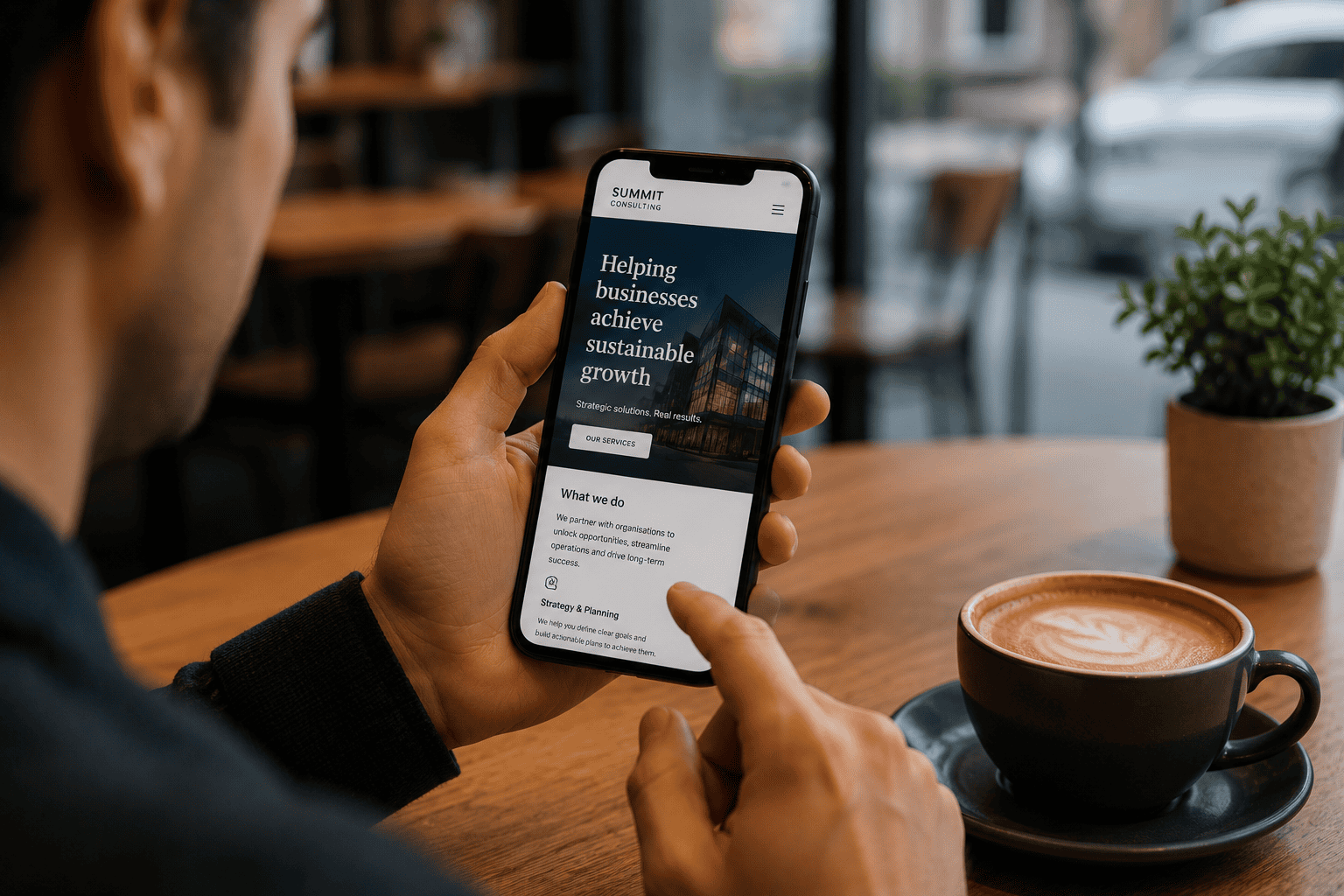
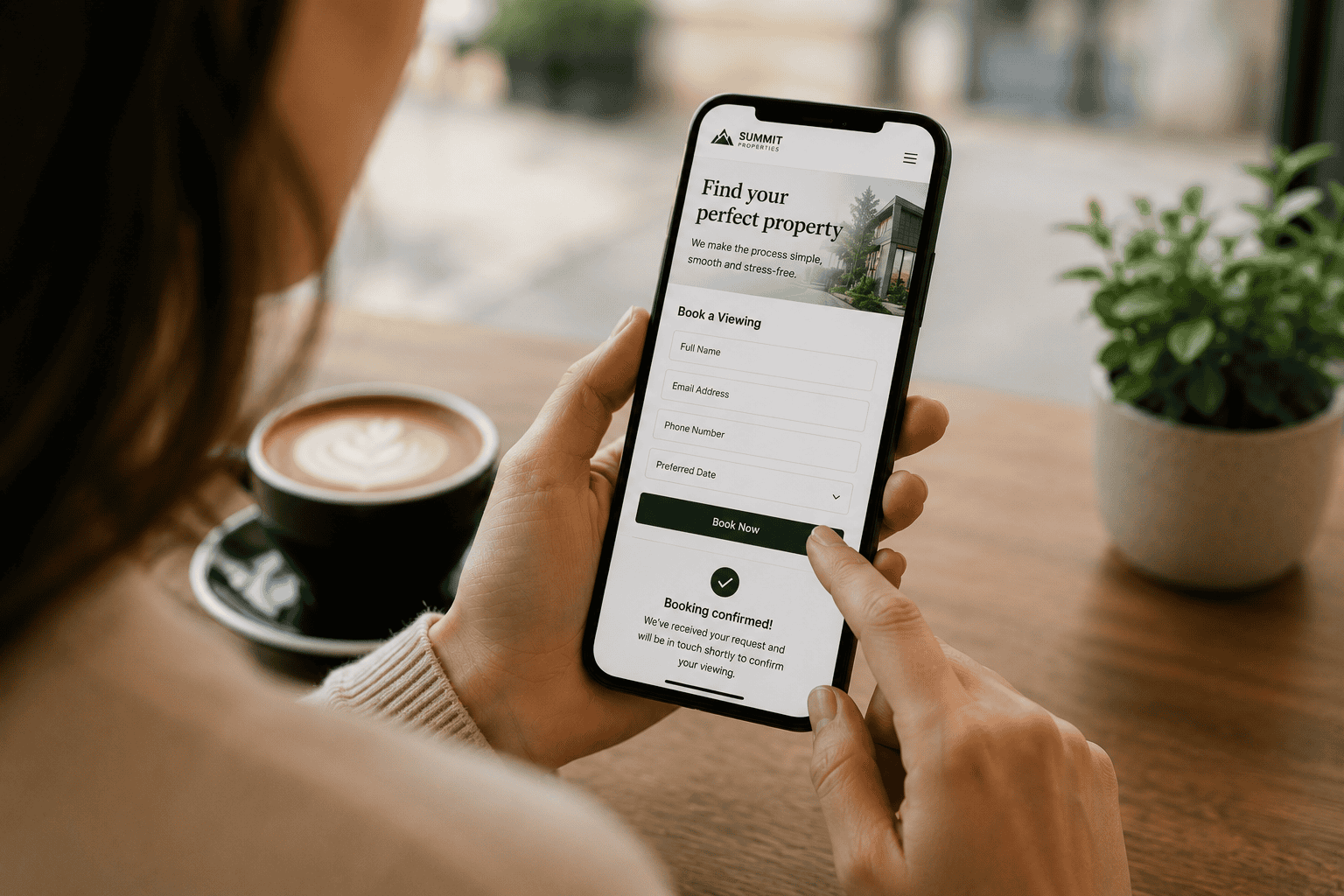
Customer browsing a mobile-friendly website on a smartphone

1. The Rise (and Ongoing Reign) of Mobile

1.1 Mobile Usage: A Quick Snapshot

We’ve all heard the statistics: mobile traffic officially overtook desktop usage several years ago. Now, in 2025, more than three-quarters of global internet traffic comes from mobile devices. This trend shows no sign of slowing, driven by factors like:

Growing smartphone penetration in both developed and emerging markets.

Improved network speeds, including widely accessible 5G (and the oncoming 6G horizon).

Wearable technology and internet-enabled devices that blur the lines between “phone” and “computer.”

What does this mean for web design and user experience (UX)? Quite simply, if your site isn’t optimised for mobile users, you risk alienating the majority of your potential audience.

1.2 The Mobile-First Approach vs. “Mobile-Friendly”

It’s easy to assume “mobile-friendly” equals “mobile-first,” but these are two distinct philosophies:

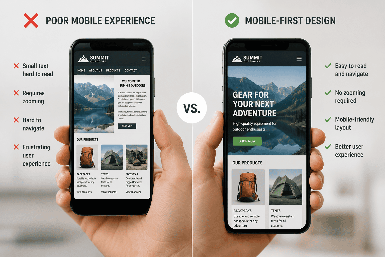
Mobile-Friendly: Ensures that a desktop-based website is responsive and looks good on smaller screens.

Mobile-First: Starts the design and development process with mobile devices as the primary target, then scales up to tablets and desktops.

By prioritising mobile during the initial design phase, you’re not just shrinking a site to fit a smaller screen—you’re creating experiences that feel native to the way users browse, tap, and scroll on mobile devices. This approach inherently leads to cleaner, faster, and more intuitive websites.

2. Why Mobile-First Still Matters in 2025

2.1 User Expectations Have Skyrocketed

Today’s mobile users demand instant gratification—pages that load within seconds and navigation that’s simple and intuitive. Slow, clunky mobile experiences lead to higher bounce rates and abandoned carts. A mobile-first design ensures your site is primed for swift loading and a seamless user journey, whether someone is on the bus, in a café, or multi-tasking at home.

Moreover, 2025’s consumers are accustomed to high-quality native apps. They expect a similarly frictionless experience when they visit your website. This puts enormous pressure on designers and developers to replicate app-like fluidity and responsiveness in a browser-based environment.

2.2 Search Engines Reward Mobile-Focused Websites

Google’s shift to mobile-first indexing, which began rolling out in earnest several years ago, continues to evolve. In 2025, search engine algorithms are more sophisticated in measuring user experience signals such as:

Core Web Vitals (Largest Contentful Paint, First Input Delay, and Cumulative Layout Shift)

Mobile responsiveness (automatic resizing, intuitive navigation)

Page loading speed on 4G, 5G, and potentially emerging 6G connections

Sites that excel in these areas typically see improved rankings. By adopting a mobile-first approach, you naturally optimise for these crucial metrics. Additionally, voice search—often used on mobile—continues to rise in popularity, meaning mobile-first sites that are well-structured for conversational queries also have a distinct SEO edge.

2.3 Enhanced Accessibility and Inclusivity

An often-overlooked advantage of mobile-first design is its role in improving accessibility. A clutter-free layout with clear tap targets, balanced contrast, and straightforward navigation is friendly not just for the average user, but also for those with visual or motor impairments. Designing with the smallest screens in mind helps enforce a minimalist style—only the essentials remain. This approach typically benefits every visitor, ensuring your site is usable by the widest range of audiences possible.

Comparison between a poorly optimised mobile website and a responsive mobile-first design

3. Key Trends Driving Mobile-First Design in 2025

3.1 Dark Mode and Thematic Colour Shifts

While the option to switch to dark mode has been around for a few years, in 2025, it’s virtually the norm. Users can toggle between light and dark themes depending on personal preference or ambient conditions. Designing a site to accommodate theme shifts smoothly is now a must. Careful attention should be given to contrast ratios, typography, and brand consistency across both modes.

3.2 AI-Powered Personalisation

AI-driven personalisation isn’t just about product recommendations anymore. Modern algorithms can adapt layout elements based on user behaviour, time of day, or even device battery levels. For example, if a user frequently accesses your site in bright outdoor conditions, the interface might automatically switch to a higher contrast for better readability. By prioritising AI personalisation in your mobile-first framework, you create a truly tailored experience that resonates with each individual user.

3.3 Augmented Reality (AR) Integration

With the advent of more powerful mobile processors, AR experiences have become common on e-commerce and service websites. Imagine trying on a piece of furniture in your living room with your phone’s camera or previewing a hairstyle before booking an appointment. These AR features require a user interface designed specifically for smaller, handheld screens. A mobile-first approach ensures your AR elements are intuitive and robust.

3.4 Gesture-Based Navigation

Home buttons have been disappearing for years, but by 2025, gesture-based controls are even more ubiquitous. Swiping, pinching, and tapping gestures now form an essential part of modern UX. Mobile-first designs capitalise on these intuitive actions, allowing users to navigate your site with minimal friction. For instance, a quick swipe can reveal a hidden menu or a pinch-out gesture can bring up additional content.

mobile responsive website

4. Best Practices for Mobile-First Design

4.1 Prioritise Speed Above All Else

Your site’s performance is tied directly to user satisfaction and SEO. Some ways to ensure speed:

Optimise images and videos: Use next-gen formats (e.g., WebP), compress files, and serve media at the correct resolution for each device.

Leverage lazy loading: Load content only as it’s needed, reducing initial load times.

Minimise scripts and CSS: Inline critical CSS and defer non-critical scripts.

A snappy mobile-first site not only retains users but also signals to search engines that you prioritise a positive experience.

4.2 Keep Navigation Simple

On a smaller screen, even the slightest complexity can become daunting. Some navigation tips:

Use a clear, concise menu: Prioritise the most important sections.

Sticky navigation: Keep key navigation elements visible as the user scrolls.

Easy returns to homepage: A visible home icon or company logo leads back to the main page.

In 2025, minimalism isn’t just a design trend; it’s a usability necessity.

4.3 Employ Responsive and Adaptive Techniques

While mobile-first means starting with the smallest screen in mind, your site must scale gracefully up to tablets, desktops, and even large smart TVs:

Fluid Grids: Use percentage-based widths and min/max values to ensure elements resize appropriately.

Adaptive Images: Serve different image sizes based on device width and resolution.

Breakpoints: Define breakpoints for common screen sizes (mobile, tablet, laptop, desktop), ensuring a smooth transition between formats.

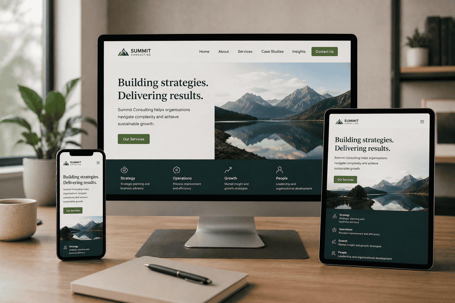
Responsive website design adapting seamlessly across mobile, tablet and desktop devices

4.4 Make CTAs Prominent and Tappable

Calls-to-action (CTAs) are the lifeblood of most websites. On mobile, they must be instantly visible and easy to tap:

Use high-contrast colours that stand out from the background.

Button size: Aim for a minimum touch target of around 44×44 pixels to accommodate different finger sizes.

Minimal text: Keep the CTA message crisp—nobody wants to read a paragraph on a button.

5. Mobile SEO Optimisation Tips

5.1 Embrace Schema Markup and Structured Data

With smaller screens and heightened competition, rich search results are more valuable than ever. Schema markup helps search engines understand your content’s context, making it eligible for rich snippets, FAQs, and other eye-catching search features. For local businesses, ensure you use LocalBusiness or Organisation schema to show up in local searches more prominently.

5.2 Optimise for Voice Search

Voice assistants are increasingly baked into our daily routines. By 2025, many people use them on mobile devices to complete tasks hands-free. Focus on conversational keywords, long-tail phrases, and a concise style of writing. Consider creating Q&A sections that directly address common user questions with succinct, direct answers.

5.3 Ensure Fast Server Response Times

Even if your site is lightweight, a slow server can sabotage your performance. Employ caching strategies, use a reliable hosting provider, and consider content delivery networks (CDNs) to deliver content from servers closer to the user’s geographical location.

5.4 Leverage Progressive Web Apps (PWAs)

PWAs bridge the gap between websites and native apps, offering features like offline access and push notifications. They also load faster, thanks to caching mechanisms. In many cases, a PWA can appear as an app icon on a user’s device, deepening engagement and brand presence.

Customer successfully interacting with a mobile-first website using a smartphone

6. Case Studies: Real-World Impact of Mobile-First

6.1 Retailer Increases Conversions by 40%

A mid-sized ecommerce retailer decided to redesign their site using a mobile-first strategy. By simplifying navigation, optimising product images, and integrating AI personalisation, they reduced page load times by half. As a result, mobile users spent more time browsing and the site’s checkout abandonment rate dropped significantly—leading to a 40% boost in overall conversions.

6.2 B2B Website Gains Search Visibility

A business-to-business consultancy found that their mobile traffic bounce rate was much higher than on desktop. After a mobile-first overhaul, which included better readability for white papers and easy-to-tap contact buttons, their average session duration on mobile climbed by 35%. Google rewarded this improved user engagement, and the site jumped to the first page for several high-value keywords.

6.3 Local Restaurant Improves User Experience

A local family-run restaurant typically received most bookings via walk-ins or phone calls. Post-pandemic, they noticed a shift towards mobile reservations. By adopting a mobile-first site with a quick online booking system, they streamlined their reservation process. Within six months, they saw a 25% increase in total bookings, most of which came from mobile users.

7. How Techomatic Approaches Mobile-First in 2025

At Techomatic, we’ve been passionate advocates of mobile-first design for years, and that commitment has only deepened by 2025. Here’s how we ensure our clients’ websites remain at the cutting edge:

1.In-Depth Site Audits: We examine your site’s current mobile performance, speed, and user experience, pinpointing pain points and opportunities.

2.Strategy Consultation: Our team collaborates with you to define your key objectives—whether that’s increasing sales, generating leads, or boosting brand visibility.

3.Data-Driven Design: Using advanced analytics, AI insights, and user testing, we create designs that directly address your audience’s needs.

4.Iterative Development: We adopt an agile methodology, continuously refining your site’s layout and features based on real-world user feedback.

5.Ongoing Optimisation: Post-launch, we don’t just walk away. We monitor site metrics, tweak SEO, and apply updates to keep your website relevant and high-performing.

By combining cutting-edge technology with user-centric principles, Techomatic ensures your mobile-first website stands out in a crowded digital landscape.

8. The Road Ahead: Beyond 2025

8.1 Foldable Devices and Wearables

Foldable screens have been around for a few years now, but by 2025, they’re poised to become more commonplace. Designers must account for transitions between different screen sizes in real time, ensuring a site’s layout adapts seamlessly as a device is folded or unfolded. Similarly, wearables like smartwatches require ultra-condensed interfaces that deliver vital information at a glance.

8.2 Hyper-Personalised Web Experiences

AI will continue to evolve, enabling deeper personalisation across every facet of your site. Expect advanced user profiles that combine browsing history, location data, and even biometric information (where ethically and legally permissible) to serve content that is “perfectly you.” For businesses, striking a balance between personalisation and privacy compliance will be crucial.

8.3 The Ongoing Importance of Security

With more users relying on mobile devices for transactions and data sharing, security remains a paramount concern. HTTPS, two-factor authentication, and robust encryption have become the norm. As you craft your mobile-first approach, integrating advanced security features is a key pillar, not an optional extra.

9. Action Steps to Elevate Your Mobile-First Strategy

If you’re ready to invest in a mobile-first approach—or looking to enhance an existing one—here are some concrete steps:

1.Audit Your Current Metrics: Start with data. What’s your mobile bounce rate? How quickly do your pages load on a 4G or 5G connection?

2.Identify Quick Wins: Sometimes small tweaks—like compressing images or cleaning up JavaScript—can dramatically improve mobile speed.

3.Reassess Content Strategy: Mobile-first often means concise, bite-sized content. Can you cut down on fluff while retaining value?

4.Test Across Devices: Don’t assume that “mobile” just means an iPhone 12 or Samsung Galaxy S series. Test across various screen sizes, brands, and operating systems.

5.Partner with Experts: Working with a team like Techomatic can save you time and ensure you leverage the latest best practices.

6.Iterate and Improve: Mobile design is an ongoing process. Gather user feedback, monitor analytics, and remain open to iterative updates.

Conclusion

By 2025, mobile-first design isn’t merely a recommendation—it’s the baseline standard for anyone hoping to remain competitive in a digital world dominated by smartphones and tablets. It’s about more than just making your site “look good” on a smaller screen. It’s a comprehensive strategy that prioritises speed, usability, accessibility, and personalisation at every step.

Designing for mobile users first fosters a cleaner, more intuitive interface that benefits all visitors, whether they’re browsing on a phone, tablet, or desktop. Combine this with robust SEO techniques—like structured data, fast loading times, and voice-friendly content—and you’ll be well-positioned to climb the search rankings and capture the attention of potential customers.

At Techomatic, we see this mobile-first future as a realm of exciting possibilities. Advances in AI, AR, and device technology will continue to shape the online experience, but the cornerstone will always be ensuring users can effortlessly engage with your content from the palm of their hand. As user expectations evolve, websites that deliver on speed, usability, and personalisation will thrive—and adopting a mobile-first approach is the surest way to get there.

10 Popular types of web design

10 Popular types of web design

10 Popular types of web design

10 Popular types of web design

Can you count the number of stars in the sky? Obviously, that’s a NO. There are billions of stars out there. Pretty much like the universe, the web is vast, and you can’t know the exact number of websites running there presently. Within the split of a second, a website is added to the billions of other websites online. The amazing fact is that each of the websites is competing for a share of a specific online audience. At a point when you are thinking about the best ways to build your website or choosing the best hosting site online, you might not remember the fact that your new website will be competing alongside billions of other websites.

There are different categories of websites on the web, and each has a specific online audience. It is not enough to learn about search engine optimization (SEO) and the best ways to introduce your products and services to your target market. When it comes to building a website or searching for the best ways to attract the right traffic, most people only consider billing, hosting and SEO. But you have to consider the type of website you want it to be or the category you want to belong. That way, you could narrow down your search for a good web design company more efficiently.

Below, we have revealed the top 10 popular types of web design. Find out their major differences and where your website belongs.

E-COMMERCE WEB DESIGN

If the purpose of your website is to sell a particular product or service to a target audience, then you would need an e-commerce web design template on your website. Most web owners think that an e-commerce web design is only suitable for a marketplace website or a multi-vendor e-commerce website, not at all. An e-commerce web design is also important when you wish to use content marketing to promote your service or brand. Either way, its purpose is to lead your website visitors through the buying process from the beginning to the end. This can be done by fusing “call to action” buttons on strategic places on the web page. Such a web design should be optimized to ensure SEO friendliness, and the page layouts should be built to be responsive to mobile devices. This implies that the page should be able to adapt automatically to every screen type from iPhone, Android to a desktop.

Additionally, further, improvements can be made on the web pages to boost the page load speed on mobile with the help of a Google AMP. If you own an e-commerce website, your goal should be to leverage on your website’s clean design to ensure a simple and fast shopping experience.

10 Popular types of web design

BUSINESS WEB DESIGN

A lot of businesses have seen the feel a corporate website gives their business. It helps them to project a corporate image in the midst of competition. In today’s fast-paced business environment, the significance of a business web design often goes unrealized. Your business website is the face of your business online. It represents your brand and what it stands for. Hence, effective web design is most critical to its success. A company uses a combination of its web design, branding strategies and content to portray its brand uniqueness and communicate with the target audience. Unlike an e-commerce web design, a business web design is not meant to assist a company in making direct sales of its products, but its goal is to enable them to use the website to provide valid information about themselves and their corporate identity. It helps large firms to communicate their missions, demonstrate thought leadership and drive sales-ready opportunities. It links potential customers to the business by providing information on how they could contact the company in any given circumstance. If your goal is to create awareness about your business and what it stands for, then a business web design is what you need. 

ENTERTAINMENT WEB DESIGN

It’s simple! They are website designs used for businesses in the entertainment industry. Is your business centered on movies, plays, music or event? Your website can only entertain your audience or meet any goal it was designed for when you factor in entertainment web design solutions. If you are a comedian or an entertainer, you don’t have any business with corporate identity and branding. You should build a website that entertains your audience. It could also take the form of a promotional website. Either way, the goal is to sell your business or promote an upcoming event or a show.

PORTFOLIO WEB DESIGN

A portfolio website design is a vital tool that helps you to build your professional brand and get more clients for your business. In any genre or aspect of life, your portfolio says a lot about you and what you represent. It is even more important than a traditional resume. Irrespective of the industry you work in, whether you are an engineer or a freelance journalist when people search for your name on Google, your portfolio will provide the most comprehensive details about you.  A portfolio web design is of utmost importance to web designers and anyone seeking employment or bidding for a contract. Its purpose is to furnish a prospective client with relevant information of who you are, what you can do and why you are the right person that can execute that project.

Technically, the design of your portfolio should showcase your work while sharing a similar look and feel with the rest of your website. Such continuity is essential to assure readers that they are still on the website. Your portfolio web design doesn’t have to overpower the work that you intend to showcase to your audience. Use a mix of good colors and design to tell your audience more about you and your abilities.

A portfolio website design could also be your art gallery showcasing your work as well as your calling card. It gives you the unique opportunity to portray your skills and reveal your most impressive projects. In most cases, the manner in which your portfolio is designed could make a client contact you with a project proposal or an offer.

Others on the list of our 10 popular types of web design are:

NON PROFIT WEB DESIGN

A nonprofit web design is meant to advocate and convey the belief, approaches, visions, and missions of nonprofit organizations. Such a website designed for nonprofits is more than a mere digital brochure and at the same time far from a hungry sales machine. Suitable nonprofit web design needs to:

  • Share the impact of their cause successfully
  • Tell a story to aid brand building
  • Engage users and solicit actions.

An ideal web design for nonprofits should be a tool that creates excitement around a specific cause and solicits continued support and attention. However, one important design feature of a nonprofit website is its high level of user engagement. It draws its audience by applying bright imagery, video, and graphics. Whether your organization is involved in child or project sponsor, travelling to third world countries or helping the poor, the website should be focused on encouraging readers to join a cause or contribute directly to a donation. This can be done by embedding a “donate now” button which may propel readers to give out in support of your mission.

Nonprofit web design is seen as incomplete if it lacks a mission and vision statement. A user visiting the website should be able to understand the idea behind the organization. Furthermore, the user should be able to find the donate button without much stress.

10 Popular types of web design

EDUCATIONAL WEB DESIGN

This type of website design is best used for websites that are popularly referred to as “how-tos.” They aim to provide the user with relevant information they seek. For instance, how to design a website; if you type those words into a search engine, I’m sure you will be amazed by the thousands of results you will get. If your website is intended to inform your audience on a specific subject matter, then it should fall within this category.

Aside from these, the educational website goes beyond an informative website. Educational web design is also suitable for the site building of universities, schools and other educational institutions.

There is a different methodology in web design for educational institutions that enable them to place in-demand programs on display for both students and intending students. When you are planning to build a website for an educational institution, you have to understand that it is far different from a business website. First, consider the needs of the students, and how the university is planning to provide such needs. Educational website design is less demanding. Since it is designed for information purposes, its goal is to communicate as much information as possible to satisfy the user’s curiosity and perhaps help to make a decision based on the information provided. However, it is easy to load a website with tons of irrelevant information to fill up space, this will make the website less impactful, and the user may not benefit from the content you provide. So ensure you apply a blend of text and visuals to improve the user experience.

BROCHURE WEB DESIGN

This is the simplest type of web design you will ever come across. A typical website built with a brochure web design will feature just a few pages. It is used by businesses that need a little online presence. I usually comprise of a homepage that displays contact information, an about us page and a few photos o demonstrate previous work.

The brochure web design was high in demand during the earliest days of the internet when firms knew they needed to promote their brand on the internet but depended less on it as their primary marketing strategy. Although the business environment has become fierce and more firms are entering the market on a daily basis, most companies still prefer to have a little online presence. Hence, the brochure type of web design is still in vogue.

If you have a business and you rely on an external source other than the internet to create brand awareness and increase sales, then, you need an online business card, and that is the purpose of a brochure web design. However, business owners need to note that there would be an urgent need to change their website design template from a brochure to corporate web design in the future when their goal and priorities change or whenever they need to adapt to the pressing needs of the business environment.

10 Popular types of web design

BOOKING WEB DESIGN

If you are operating a hotel or some other type of reservation system, you’ll appreciate a booking web design even more. It’s not just to showcase your properties to potential guests, but also to offer the entire public a fast and easy way to book. Plus, they can eserve a spot or a room and also enable you to receive payments with ease.

A booking web design is suitable for any business that is centered on providing luxury properties or products to people and whereby they have the option to either pay at the facility or make the payment online. Such a website will be set up with a complete booking software integration.

Note that it is vital for a booking web design to be fully responsive and adaptive to both iPhone, and desktop. The fact that hotels make more money when guests book directly through their website is more reason why many hotels invest heavily on huge campaigns to get the needed audience they need and introduce them to their facilities.

MEDIA WEB DESIGN

This has several similar features to the entertainment web design. It is the best web design for any website whose purpose is primarily to collect news, stories and other information for reporting. The content of such a website is not purely for entertainment purposes. And they involve more of reported pieces of information. Media websites often have ads embedded. Such sites usually earn money from those ads when users click on them. It is particularly needed by those who need their website to serve as a major marketing tool and at the same time be a good place to source for reliable information about the society or environment.

WEB PORTAL WEB DESIGN

This type of web design is complex and requires more complicated programming than the others. It is specifically meant for internal purposes. They are created by most organizations, businesses or institutions. The aim of using this web portal web design is to provide relevant information to those who need it by collecting the information from various sources and in different formats as well. Users are mostly required to enter their login details to ensure that the information is always protected and used by those who need it.

The web portal web design is mostly adopted by schools and businesses that require users to gain access to the site or make payment for a product, service or course online.

HOW TO CHOOSE THE BEST WEBSITE DESIGN

If you are about to create your website, an important aspect of your website planning phase is choosing the right website design that suits your goal. Here are a few tips to help you achieve it. 

DON’T GET CAUGHT IN THE DESIGN FRENZY

Recently, there have been more choices in the website design industry than ever before. As hard as it may seem, all these choices make the process of choosing the best website design more difficult. But with the right knowledge, you can make the best choice. Search for other websites in your niche and examine their design and responsiveness. What do you admire about the desire? Perhaps, you can incorporate it into your design.

DEFINE YOUR TECHNOLOGICAL NEEDS

What kind of functions do you want your website to have? Do you desire to have a brochure website that has just basic info about you and your brand? Or do you want a complete website designed with all the vital aspects embedded in it? Providing answers to these questions is critical because your website design determines the way your website will be built and the target audience it will be programmed to attract.

HOW DO YOU WANT YOUR WEBSITE TO LOOK AND FEEL?

This will need you to see your website through the eyes of the user creatively. If your perception is bad, then a user is going to have a bad experience from using the website. The best way to avoid such a pitfall is to try as much as possible to eliminate vague concepts and ideas when planning your website design.

Without a doubt, choosing the best website design for your brand could be a lot of work. You will have many options to pick from, and you might even be sceptical at first. We have carefully explained the top ten popular web designs and the kind of business they are suitable for together with a few tips to consider before choosing any one of them. We hope you will find them useful when building your site.

If you would like to use the text or infographic feel free to as long as you place a link back to this page to give credit 

Reasons to use WordPress is your website design

Reasons to use WordPress is your website design

Reasons to use WordPress is your website design

WordPress is one of the most popular content management systems out there. It is used for all types of websites including Brochure websites, eCommerce websites, blogging websites, all kinds of business websites and much more. Some 25% of websites out there in the world wide web are built in WordPress and successfully so. This begs the question “why should you choose WordPress for your business website”. After all, there are tons of other options such as Wix, Weebly, Drupal, Squarespace and even Shopify.

Reasons why you should choose WordPress for your business website

  1. Lots of options –

If you’re looking to put contact forms on every page or help with your SEO, there are thousands of plugins to help you with anything you can think of. Maybe Your want to connect a subscribe form with mail chimp for email marketing.

Plugins are updated regularly by the developers and there are quite a lot of free plugins if you don’t have the budget to invest. Paid plugins are better but not always we use a host of free plugins on our websites.

2.WordPress is easy to learn and understand

Lots of people are now choosing to use WordPress because it’s easy to learn. The content management system is fantastic for all kinds of websites. If you have the time available to learn WordPress there are tons of help sites out there. We always would recommend WordPress to our customers as if they have the time they really can get involved with updating their website. There is no need to hire us for every single change that you want to make to your website. All we would recommend is to spend some time taking one of our WordPress courses.

Reasons to use WordPress is your website design

WordPress has been around for well over a decade and because it takes up such a large per cent of the market you can understand why it’s great for SEO. The way WordPress is designed is to facilitate search engines to crawl your website, in turn, this is loved by the search engines such as Google. Plugins for SEO such as Yoast is fantastic for your WordPress website. Yoast uses a traffic light signal to let you know if your content is structured the right way and easily readable. We know there is much more to SEO than this but using a plugin such as Yoast enables business owners to add blog posts and updates to their website using Yoast as a guide.

  1. WordPress is great for security

Because WordPress is so popular there is a worldwide community that is dedicated to helping the CMS your business uses become more secure and up to date. Plugins are updated regularly to make sure that they are up to date with all the latest patches. What’s more, the WordPress plugin directory lets your know when the plugin was last updated and how popular it is. This gives transparency to you the website owner before using any plugins.

In summary, we love WordPress in fact it is our favourite platform to work on. Ask us questions on how we can help build your business website in WordPress, so you can maintain it yourself. Or if you don’t have the time to learn we can maintain it for you.


If you would like to use the text or infographic feel free to as long as you place a link back to this page to give credit

Why good website design is essential for your business in 2018?

WHY A GOOD WEBSITE DESIGN IS ESSENTIAL FOR YOUR BUSINESS IN 2018

WHY A GOOD WEBSITE DESIGN IS ESSENTIAL FOR YOUR BUSINESS IN 2018

When talking about web design, first impressions are huge. A website that is attractive is essential in today’s 21stcentury market. In today’s look online first era it is many peoples first view of a business. It might not be what you would like but unfortunately customers are already judging your business by what they see online first. If a company shows a lack of effort online, it does make you wonder what other areas of their business they put a lack of effort in. We would like to think it’s not their service and products but it does make you think.

What makes a good website design

Below we will look at what makes a fantastic website and what can help turn visitors into customers.

  • Fantastic branding and logo
  • Easy to read the text and make use of visual aids.
  • Website colours that match the brand
  • Brilliant clear and visible call to actions
  • Easy to navigate around the website

In today’s modern world a lot of people are always on the go and want their product or service yesterday. This is why it’s important as well as ticking the points above you need to be clear in your message and what service or products you are selling. With more and more people using their mobile phones you need to make sure that your website is mobile responsive for any phone or device including all the browsers available.

A website developer knows all too well how approachable you need to make your website. Talk to the end-user just as you would in your shop or at a meeting. It’s important to show you care about your business and brand just as much as you care about the product or service you provide. We all know that when you receive excellent service and enjoy the experience you are far more likely to use it again.Why good website design is essential for your business in 2018?

A website for your business is one of the smartest investments you can make. Most people when looking at their business have no idea on what they think a great website should look like and what functions it should provide.

Below we will talk about why a fantastic sold website really is important for your business.

  • Your website is a reflection you, your business and your products and service you sell. If your website looks thrown together and no real care or effort has gone into it, they will perceive that’s how your business and you are as a whole. On the other hand if your website looks well-constructed and professional. Your potential customers will think that you have enough customers to afford to put into a decent website which means you provide a good service or good products. A lot of people will attempt to build a website themselves we encourage it but please be mindful I can build walls it doesn’t mean it will support a roof. If in doubt speak to a professional and seek good advice from other successful website owners.
  • Your website can bring extra local business and having a solid website can mean your business grows. Local customers usually come from as we spoke about above people who use their mobiles to find businesses like yours online. If they find one of your competitors and their online presence and website looks better than yours or worse still you don’t have a website they are far more likely to choose your competitor over you.
  • Your website does not have to just be local business. When your online it’s like giving everyone in the world an opportunity to find you. Granted you might not be at the top of the list if a user is looking for something more local to them but then maybe you’re the next town over and have a product or service they just can’t find local to them. Better still if you’re an ecommerce store then you can sell to people from all over the world.
  • If a local newspaper or magazine is looking for a quote for their article they are far more likely to choose a business that cares about their online presence. A media mention can work wonders for your business. I have seen one mention of a local business in a local paper book up a business for the whole year. Now we know that these are not easy to come by, but you have to be in it to win it.

So why does good web design matter?

In summary when looking at your business make sure you choose to build a website that you can really be proud of and you know you have every chance or bringing new customers on board. Hire a web designer you know has a proven track record.

Check out some of our articles including – How much should website design cost

If you would like to use the text or infographic feel free to as long as you place a link back to this page to give credit 

How much should a WordPress website design cost?

How much should a WordPress website design cost?

How much should a WordPress website design cost?

How much should a WordPress website design cost?

When thinking about website design costs there are lots of factors to look at. In this article, we will look at all the things to consider when looking at pricing website design costs.

  • What web design services are you looking for?
  • How long do you want the website designer to spend on the project?
  • What is your targeted return on investment from the project?
  • What budget are you looking to spend?
  • Are you looking for continuous changes throughout the year?
  • Do you have a business plan?
  • When would you like the website completed by?

All the above questions are very important when looking at the costs of a website. As you speak to your website developer they will talk you through various options and could even help you save money in some areas after all technology is meant to aid.

One of the things that can affect costs is market location so for example, booking a website in the UK will be differently priced to booking a website in the USA.

We have been a part of websites ranging from under £1000 all the way up to £20,000 and the budget would be even higher if you include marketing costs.

Because there are so many factors that is why we never give any prices on our website for website design. From our experience, most people’s expectation of costs is 2-3 times lower than the actual costs. Unless you have experience of being involved with a website project before it takes a bit of time to understand this.

When working with large website design specifications

A large website design project takes a lot of time to spec out. Most large specifications can take days to spec out and that’s totally normal when a designer puts this together they usually take this into account before deciding to provide the specification.

How much should a WordPress website design cost?

Are you using a website design agency or a freelance web designer?

An agency tends to be more expensive but they usually have the resources to take on any issue that may arise in the project. An agency normally has more staff so they can deliver your project quicker which helps when you have a deadline.

If you choose to work with an agency there is a much lower chance of them disappearing. We hear the horror stories of website designers going bust on people or simply getting a decent offer from an agency and giving up the freelance route. The good guys will take you with them.

If you choose a freelancer, they are more likely to disappear and usually move much slower than an agency as they have other staff members they can call upon. When choosing a freelancer, you need to vet them more than an agency. The benefit of being a freelancer is that you will work with the same person from start to finish. Small agencies are something in-between and a lot of people prefer this route as they tend to get benefits of both.

It’s a personal preference for you when choosing an agency or a freelancer. There are some fantastic website designers in both areas.

Freelancers are usually good for projects that are:

The job is the right size for one person (most projects usually are)

You are looking for them to start asap.

Communication can be relaxed and informal.

Big agreements don’t need to be signed just a simple agreement.

Agencies are usually good for projects that are:

You like to follow a project structure

You don’t want the risk of the website designer disappearing.

Large projects that need more staff working on them.

You don’t mind waiting to fit into their project schedule.

A dedicated project manager.

Pricing of website design

Were not going to talk about hourly billing against project billing as either has its benefits. In both cases, the website designers you choose have to estimate the amount of time the project will take and charge accordingly.

It doesn’t matter if the web designer is an agency or freelance usually around 80% of the time is productive time actually working on the project. This should be the target of all agencies and freelancers that way the customer will receive the best value for money. In an agency, this is usually slightly less because they will have managers that don’t usually work directly on the project as in developer work.

We’re also talking about no subcontracted work as we know some of this goes on in the industry from time to time.

If we work from a simple equation if the rate is £30 per hour and the design takes 60 hours and take into consideration 20 hours for project management then you have a total of 80 hours and the project would cost £2400. Profits are usually built into the hourly rate and not always but in most cases you get a better rate of work from an agency.

Agency hourly rates

Small Agency £30 – £50 per hour

Medium Agency £50 -£100 per hour

Large Agency best in industry £100 – £200 per hour

Freelance hourly rates

Beginners – £15 – £25

Intermediates £25 – £35

Advanced £35 – £50

Usually, you find agency’s and freelancer rates increase dramatically in large cities or towns for example an agency in London will change far more than a website design agency in Bradford. In places like London the fees will be huge.

Everything we talk about today are estimated there are some out of the ranges we have spoken about today.

The other thing to note is that if a freelancer or agency have space they will discount to get you booked in. This happens all over the place. Also, if your offering a project that is great for their portfolio they also might discount the fees.

Discounts are usually offered if there is a retainer on the back of the project or if there is a chance of repeat work.

The client the project is for is a part of the price factor. If it looks like a straightforward project and the customer is fairly open to your ideas and ways of doing it then it will be priced accordingly. On the other hand, if the customer wants to try different ideas and feel of the website then this will be priced accordingly too.

In summary, don’t be surprised if you find different prices out there just ask plenty of questions and you won’t go far wrong. Always get a spec whether your working with a freelancer or working with an agency at least this way you will know where you stand.

If you would like to use the text or infographic feel free to as long as you place a link back to this page to give credit 

Why a cheap website will bring cheap results

Why a cheap website will bring cheap results

Why a cheap website will bring cheap results

As a team of proven website developers, we are never short of work coming in but time and time again we come up against one question “Why is such and such companies only charging £99, £199 and £299 for a full website?” the reality is simple these websites do not bring results. Hiring a good website developer is just like buying a car for £50 it might look acceptable on the outside but underneath the hood, the engine thinks it’s time to retire.

Cheap Website Build Quality

Cheap websites are often built with a non-growth attitude and are simply after a quick buck. You may as well build the website on Wix yourself and enjoy the process. Wix is not good for any type of SEO especially if you want to beat your competition. Cheap websites are often made in the exact same style and code as 80 websites in your area. This in turn means that Google is reading this code and structure as duplicate content. Google penalises duplicate content and ranks these websites bottom of the pile.

Pay Cheap Pay Twice

Why a cheap website will bring cheap results

Cheap SEO

Websites that have only cost a couple of hundred pounds are worth far less when they go live. If you contact the top 5 companies in your industry and ask them how much they spent on their website and SEO they will tell you a fortune however they will also agree they couldn’t live without it. When you compare this to fantastic SEO there is no comparison at all.

However, all is not lost

There are some fantastic priced website developers out there that will do a fantastic job and it won’t break the bank. A website should be thought about in the same realm of paying a member of staff for a month’s work. If you are in a competitive industry it may take two or even three salaries to get you to the top. However, once you are there you can reap the rewards of being the go-to company for your industry.

Talk to us and explain your budget and what you would like to see for it. We will go through why your budget is more than enough or if it needs tweaking we will be honest with you on what to expect.

If you would like to use the text or infographic feel free to as long as you place a link back to this page to give credit